Description
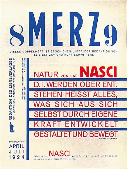
"Merz Magazine Layout - 1924" of El Lissitzky is a work that encapsulates the innovative and bold spirit of constructivist art of the early twentieth century. The Lissitzky, an outstanding figure of Russian avant -garde, joined movements such as suprematism and constructivism, his work being a turning point in the transition of art towards modernity.
The composition of this work deserves detailed attention. Predominantly monochromatic, the color palette is mainly dominated by white and black, with accents in different tones of gray. The structure is geometrically precise, pointing to the rigor of the graphic design of the time. In "Merz 'Magazine Layout", the Lissitzky opts for rectangular shapes and straight lines, which intersect and converge forming a visually intriguing and balanced structure.
This design not only serves as a piece of autonomous art, but also as a visual manifesto of Merz magazine, edited by Kurt Schwitters, one of Lissitzky's main collaborators. The influence of Schwitters is evident in typographic integration and collage in the work. The typographic arrangement is particularly striking; The letters, in various orientations and sizes, give the composition of a characteristic dynamic and rhythm of the given movement of which Schwitters was a prominent figure.
The absence of characters in this work underlines the approach of constructivism in abstraction and functionalism. There is no human narrative to tell, but rather an exploration of form and space. The solidifications of rectangles and lines remind us of the functionality of architectural design, reflecting the constructivist belief in utilitarian art.
A fascinating aspect of "Merz 'Magazine Layout" is how Lissitzky challenges and redefines the concept of "pictorial surface." The work is not intended to be a window to the world, but an autonomous object with its internal space and logic. The interrelation of flat forms and letters suggests a spatiality that does not depend on traditional three -dimensionality, but on the interaction of graphic elements in the plane.
The Lissitzky was not only a painter, but also a graphic designer, architect and photographer, and his work Merz Magazine Layout 1924 reflects this interdisciplinarity. He combined the science of modern design with the artistic audacity of avant -garde. The influence of its ideals and techniques can be traced in various fields of contemporary design, from advertising to digital design.
In summary, "Merz 'Magazine Layout - 1924" is not only a fundamental piece in El Lissitzky's career, but also a enduring testimony of the spirit of innovation that characterized the artistic avant -garde of the twentieth century. A work that continues to challenge and evoke critical thinking and aesthetic appreciation to this day.
KUADROS ©, a famous paint on your wall.
Hand-made oil painting reproductions, with the quality of professional artists and the distinctive seal of KUADROS ©.
Art reproduction service with satisfaction guarantee. If you are not completely satisfied with the replica of your painting, we refund your money 100%.

