Description
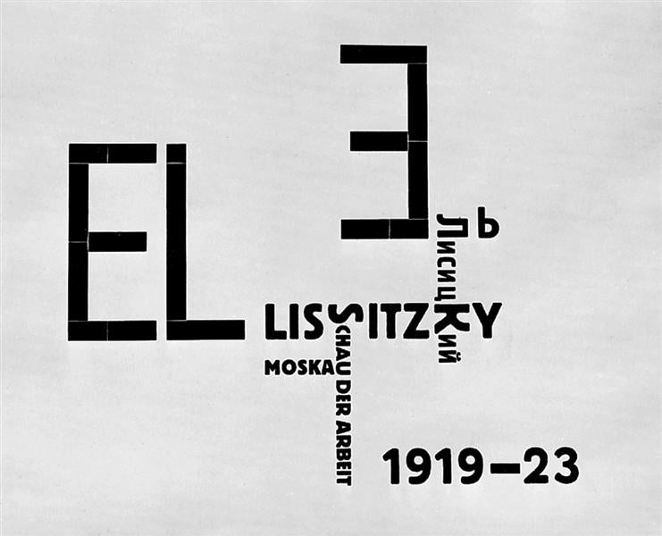
In the geometric and bold representation of "Catalog cover - 1923" of El Lissitzky, we find a work that exemplifies the break with the pictorial tradition of the nineteenth century and the firm roots in the Russian constructivism and the European avant -garde of the early twentieth century. This work, although apparently simple in its composition, is a complex manifestation of the interaction between art and graphic communication in a time of fervent innovation and cultural transformation.
The Lissitzky, whose full name was Lazar Markovich Lissitzky, was a central figure in the constructivist movement. His work focused on the creation of a new visual language that would use geometric elements and primary colors to express modern ideals. On "Catalog cover - 1923", this vision is displayed by arrangement of basic triangles, rectangles and circles locked in a two -dimensional space. These forms not only have an aesthetic but also practical character, since this type of design was frequently used for graphic design, exhibitions and avant -garde publications.
The use of colors is another vital aspect in this work. The Lissitzky resorts to a palette that mainly includes black, white, gray and red, colors that were fundamental in constructivism due to their ability to evoke emotions and transmit clear messages without the use of naturalistic figures. The choice of red color, in particular, is not fortuitous; In the Soviet Russia, red symbolized the revolution and change, recurring themes in Lissitzky's work.
On the "Catalog cover - 1923", the absence of human figures reinforces attention in the forms and colors, elements that make up the true 'protagonist' of the work. This departure from traditional figuration to focus on geometric abstraction resonates with the spirit of constructivism that sought to reflect the dynamism of modernity and the new social order that emerged in those times.
The compositional structure deserves special attention. Lissitzky organizes the elements in such a way that they produce a simultaneous sense of balance and dynamism. Acute angles and straight lines induce a feeling of movement and direction, guiding the viewer through the surface of the work in an almost choreographic way. This dynamism is essential to suggest the idea of progress and change, intrinsic values to the historical context in which the artist worked.
Finally, "Catalog cover - 1923" is more than a simple cover; It is a visual manifesto that encapsulates the aspirations of the artistic avant -garde of its time. It is a testimony of how art can transcend mere decoration and become a vehicle for revolutionary ideas, both in aesthetic and conceptual terms. The work of El Lissitzky continues to be relevant, a powerful demonstration that simplicity in form and color can lead to an infinite wealth of meanings and sensations.
KUADROS ©, a famous paint on your wall.
Hand-made oil painting reproductions, with the quality of professional artists and the distinctive seal of KUADROS ©.
Art reproduction service with satisfaction guarantee. If you are not completely satisfied with the replica of your painting, we refund your money 100%.

