Description
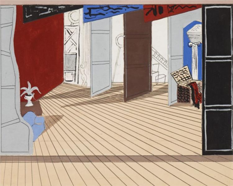
The painting "Design for the Review Cochrane - 1925" by Christopher Wood is presented as a fascinating incursion within the author's artistic universe, characteristic of his peculiar adoption of primitivism and the influence of post -impressionism. Through this painting, Wood achieves a wonderful synthesis of simplicity and evocative depth, elements that undoubtedly proclaim its originality and acuity within the canon of modern art of the early twentieth century.
He painting, Visually, it exudes a meticulously balanced structure and poetic, reflecting a composition that is presented at first sight as chaotic, but that under a more detained inspection reveals an intimate sense of harmony and balance. The use of geometric figures and shapes, recurring in his work, allow Wood to explore the interrelation between human figures and the surrounding environment, a topic that regularly takes place in their work.
What stands out most about the work is its bold color use. Wood uses a vibrant palette that essentially covers warm and terrible tones, contrasting with sporadic brushstrokes of cold colors that add dynamism and depth. This chromatic game not only captures the viewer's attention, but also infuses a feeling of movement and life, characteristics inherent in Wood's artistic production. In its color use, Wood demonstrates a unique ability to transmit complex emotions and narratives implicit through the amalgam of tones and shapes.
"Design for The Cochrane Review" is particularly intriguing due to its complex relationship with space. The characters and objects represented, although stylized and almost abstract, seem to emerge from the pictorial background as if they were part of a dream or blurred and shared memory. Humane figures, distorted and disproportionate times, remind somewhat of Jean-Michel Basquiat's primitivism or Marc Chagall's surrealism, underlining a visceral connection between the observer and the elements of the canvas. This type of unreal, inhabitual representation in its time, has cemented Wood's visual idiosyncrasy as one of the most distinctive and recognized.
In terms of composition, the meticulous care with which each element has been arranged is evident. Despite the apparent randomness of the forms, there is a clear sense of purpose in the way in which the lines and figures are intertwined, creating a visual rhythm that guides the look of the observer through different foci of interest. The main structure of painting It is built on a series of diagonals and curves, which hints a fluidity and connection between the different parts of the composition.
While "Design for the Review Cochrane - 1925" aligns aesthetically with some of the contemporary works of his colleagues, Christopher Wood provides an unmistakably his voice. Their paintings, Including this, they present a raw aesthetic while refining, a kind of force contained within the limits of a world made of dreams and symbolism.
In conclusion, Christopher Wood's painting cannot be appreciated unless his artistic and historical context is appreciated. "Design for the Review Cochrane - 1925" exemplifies the unique intersection of the author between the primitive and the modern, between chaos and the orderly structure, which ultimately verifies the lasting relevance of his work throughout the decades.
KUADROS ©, a famous paint on your wall.
Hand-made oil painting reproductions, with the quality of professional artists and the distinctive seal of KUADROS ©.
Art reproduction service with satisfaction guarantee. If you are not completely satisfied with the replica of your painting, we refund your money 100%.

