

Description
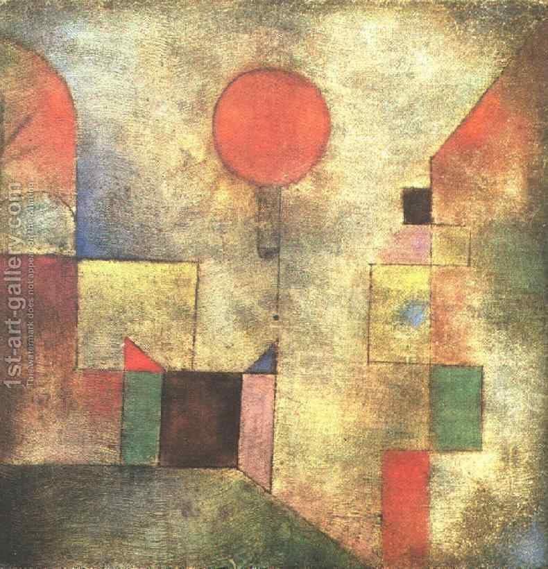
This abstract composition is arranged on a light, aged and densely textured ground, where beige, gray and brown tones provide a sober base for a set of geometric shapes. In the upper central area a simple, emphatic red circle stands out and serves as one of the main focal points. Around it are distributed rectangles, squares and bands of various sizes in red, green, blue, pink, yellow and black.
The vertical, asymmetric structure prevents a perfectly balanced reading. The shapes appear to advance and recede within the plane through changes in size, color and density. Some present themselves as defined blocks, while others are partially integrated into the granular surface. Thin vertical and horizontal lines introduce an irregular grid that connects the elements without turning them into a strict lattice. The result maintains a visual tension between geometric order and an eroded appearance.
The red circle concentrates the gaze at the top and establishes a sharp contrast with the muted background colors. It does not appear isolated: beneath it, rectangular fragments create a visual sequence that leads toward the center of the composition. Greens, blues, yellows and pinks provide variations in chromatic temperature, although the overall texture softens their intensity. Red recurs in other points and helps maintain an internal relationship between the different areas.
In the lower portion a large, dark, irregular shape extends and exerts visual weight over the whole. Its less geometric contour contrasts with the central blocks and functions as a dense visual base. This mass does not completely close off the composition, but it does alter its rhythm: the eye descends from the upper circle, crosses the color modules and finally finds an area of greater gravity. The space seems compressed, without a clearly defined illusionistic depth.
The surface has a matte, granular appearance. Variations in the ground, together with uneven edges and small interruptions of color, make the shapes seem integrated into a common material rather than cleanly superimposed. In this composition by Paul Klee, the visual interest is concentrated on the relationship between elemental signs, texture and spatial distribution, rather than on the recognizable depiction of objects, people or places.
The absence of human figures and a specific setting leaves each block open to interpretation. The shapes can be seen as independent units, but also as parts of a larger structure whose effect depends on their distances and contrasts. The light background allows the colors to stand out without becoming garish, while the dark areas introduce pauses and imbalances. The composition invites a slow examination, alternating attention between the red circle, the small chromatic accents and the concentration of weight in the lower area.
It may suggest a reflection on how perception is organized when there is no scene to interpret literally. The upper circle seems to establish a point of orientation, although the blocks surrounding it prevent the eye from resting on it for long. The large dark form below can be read as a counterweight, a boundary or an interruption, without a single mandatory explanation. Rather than imposing a closed meaning, the work invites contemplation of the unstable balance between structure and matter, clarity and shadow, repetition and accident.
When viewed up close, note how the fine lines and slight surface variations link the blocks of color without erasing their differences.
Do you have questions about our oil-painting replicas? See our frequently asked questions.